[9 minutes read]
Quick links:
- Defining biophilia
- Making the visual connection
- The green decor
- Ornate succulents
- Natural materials – all raw and rooted
- Tale of textures and patterns
- 11 Eleven by Saniya Kantawala
- House interiors by Tom and Danielle Raffield
- Svoya Studio
- The Byron House
- Perini tiles
- Royal Fernery wallpapers
- Our take
– E. O. Wilson
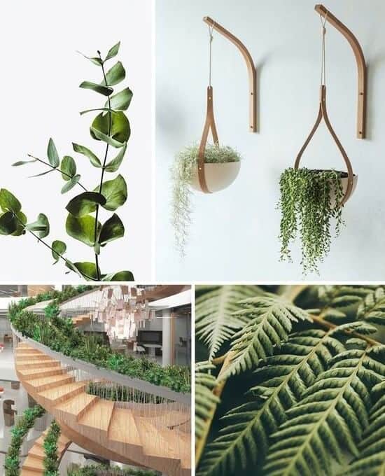
Concrete, steely, and impersonal; we are living in the ‘detached sphere’. The dire need for going paperless, being sustainable has never been more important than it is today.
The insatiable need to excel in this wireless cosmos may have made us demanding, competitive but somewhere we do seek that humble solace that often comes from nature, all raw and organic!
Open the windows. What lies beyond those glass shields? The biotic shades of greens, the raw coarseness of steady trunks, the organic mist of woody plants; yes, nature is real.
It is the ultimate truth. A row of potted plants on window sills is a common picture in almost every habitation. But somewhere it appears fractional, mundane, and habitual. Our existence, our abode can be defined and refined with verdure. Nature is patient and persistent. It soothes those tired limbs and minds. Nothing heals better than nature!
Defining Biophilia
We, humans, are blessed with a doodling hypothetical grid. The imagination prowess when used for personal enrichment brings the desired results. Biophilia too is used as a vitamin pop. It is defined as the practice of adding nature and natural elements into the built environment, known as biophilic design.
The skyscraper life – we want it all. The perks of being city men? You know the commons – demanding work life, inescapable stress, health- being the second priority, and quite a few. The result is often a prescription that underlines -Go out in nature.
Connect with it. It will do well for you. Biophilia is proving out to be a concrete measure to those who can’t escape the big city cacophony but can add a healing touch of greens in homes, workspaces. Even a glass terrarium kept on the desk – yes, it heals and how!
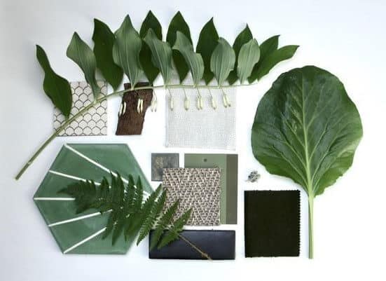
Biophilia – The botanical lexicon may add that curious coat around it, being a fancy word to imbibe, but it is slowly gaining momentum in interiors as a definite green trend. Vertical gardens, exotic succulents, lush lawn, the sustainable design grid is having a moment of mention, addition, and projection. Biophilic design breathes the goodness of nature. All real and organic!
Building biophilic spaces
So, what makes an interior space biophilic? The design draft is sketched using organic palettes. From allowing the happy sunshine to grace the porch to building a green wall, biophilic design affiliate with nature.
Making the visual connection
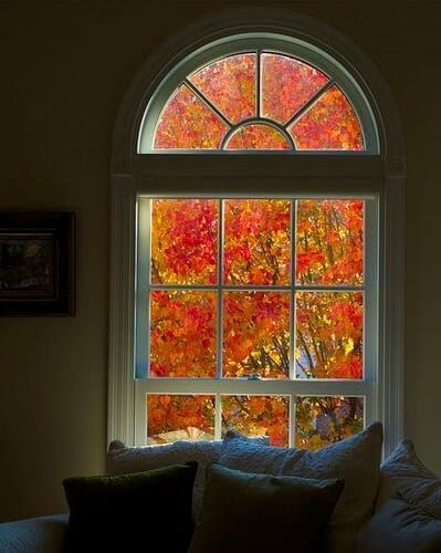
The city folks long for that escape time. Being in the good company of nature teaches one patience and persistence. It’s ok to relax and gaze at the old, alone tree, amid the technology entwining! No monk preaches that; nature does it with unspoken tunes!
- Gateway to nature every weekend seems too much? Very relatable. Establishing a visual connection from your interior is a static solution.
- For someone blessed to have big, wide windows should make the best out of it. The green view, natural light or sandy wind; witness and feel it.
- City spaces are cramped. It holds the survival tag. The ambiance; well it’s measured and tall. In such cases, you can make the most out of existing resources. Even the narrow window sills appear as a luxury to add greens and creepers!
The green decor
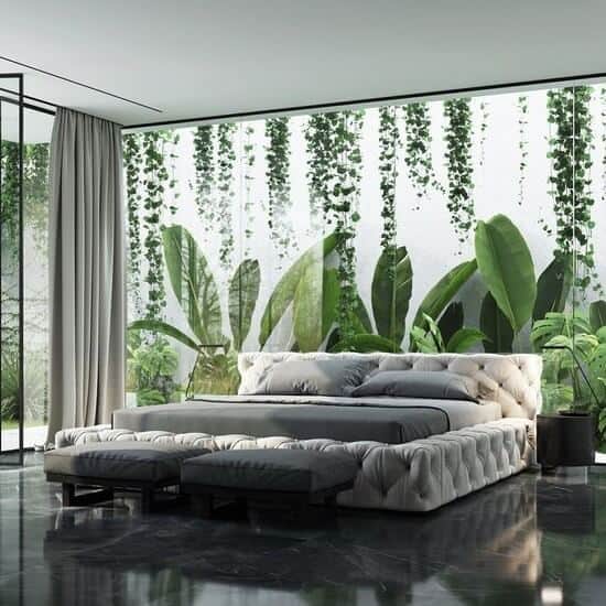
Indoor plants are an easy, go-to accessory. An interior project remains half-baked if there ain’t a hint of greens! Plants add to the aesthetics of space. There is no alternative to the botany elements.
No decoupage greens here, it needs to be real, alive and kicking. Remember plants are generous- they purify the air making our homes and workspace healthy.
- Living walls or vertical gardens are slowly making a common picture in offices, bistros. These are panels of plants, grown vertically using hydroponics (these are soilless wonders). It’s becoming a prime choice for building accent walls!
- Living green walls can either be free-standing or supported/attached to walls. Such plants are inserted into a growing, fertile medium and placed directly on the walls of buildings, properties to provide a green and healing touch.
- Since these are conceptualized as verticals, it takes just a fraction of horizontal space. The area appears tall and impressive!
Ornate succulents
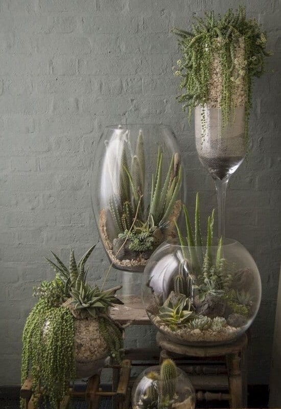
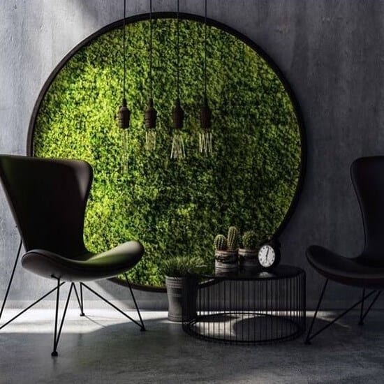
Add the succulents and forget about them. No, not entirely though. They do need minimum attention and care. They survive the harshest of environments and are super easy to care for!
- Fleshy and engorged, succulents are beauty personified. That’s not all, they grant some health benefits too. I.e. snake plant and aloe Vera are an excellent medium to cleanse the air and remove toxins.
- NASA’s research is all for adding succulents and exotic greens for they can extract around 87% of volatile organic compounds (VOC). These plants are best kept in reading environments i.e. library, study room remove VOC substances like benzene and formaldehyde are commonly found in accents i.e. rugs, cigarette smoke, grocery bags, books, and ink.
- Succulents are Equifax decor. Tabletop, windowsills, terrarium; succulents blends-in organically in the interiors!
Natural materials – all raw and rooted
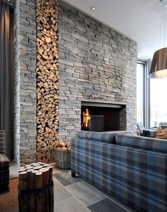
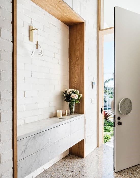
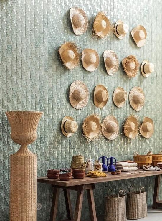
Earthy materials soothe, calms you. An interior space designed using natural materials help imbibe just that. The space with steely stances can get a warm and welcoming assurance with virgin mediums.
- Reclaimed wood adds the vintage projection. Bearing the tag of eco-friendly, these are made using existing wood, leaving the new wood unruffled.
- Bamboo, cane, rattan or hemp, and terracotta compliments the biophilic design lookbook of spaces that needs a humble and healing touch.
- Such natural materials take on the added processing quite organically. I.e. paint, inlay/mosaic work on furnishing accents and accessories.
Tale of textures and patterns
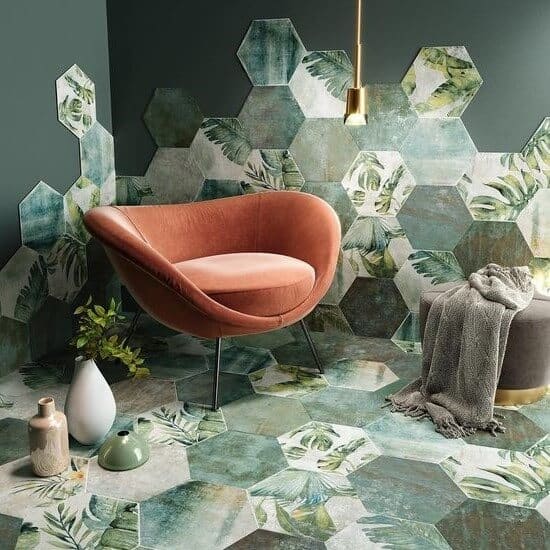
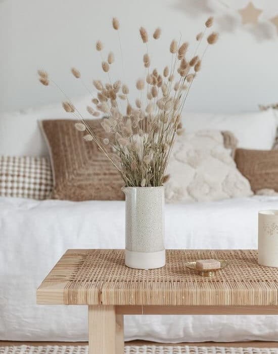
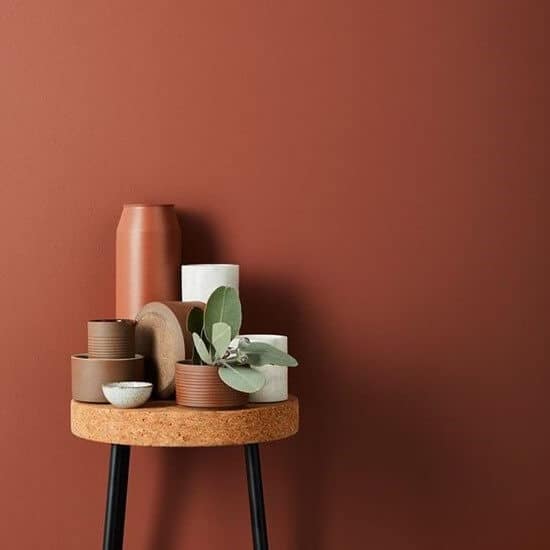

Biophilia encourages drawing a natural sketch with effervescent textures and patterns. There is so much inspiration out there to pay no heed to. There remain untapped, unexplored elements that are yet to grace the interior lookbook. The revelation is exciting enough!
- Textures of natural materials are raw and biotic. Wood, natural stone, clay made accents and accessories help satisfy our touch and visual senses.
- Organic upholstery adds a noted phenomenon. Knowing what’s good for you and nature is a sign of progression. I.e. sustainable cushions gracing the couch, adds an understated aesthetics.
- Biophilia brings in the pretty picture of lush greens and woods. Tropical patterns play vital here. Wallpapers, rugs, and other furnishings; graphed and outlined with nature as a subject is a must inclusion. I.e. Frieda Kahlo’s artwork is hugely inspired by the tropical sensibilities.
- When leaves and stems shape appears somewhat mundane, UNTAPPED geometrical shapes such as hexagons, ovals takes up the front seat in accents.
- Organic shapes have unexpected turns and twists. Such patterns dipped in nature-inspired outlines projects an exotic appeal. I.e. stone vase, organic shape wooden disc.
The biophilic frame: all lush, biotic and verdant
Spaces that embraced the exoticism of Biophilia
11 Eleven by Saniya Kantawala – Ahmedabad
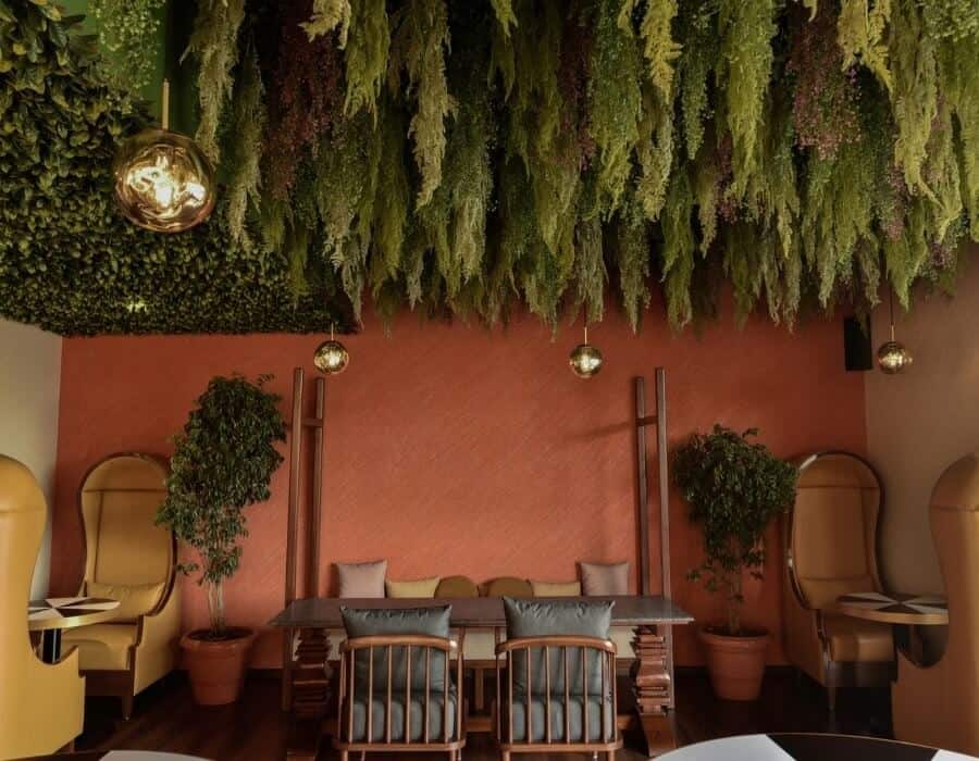
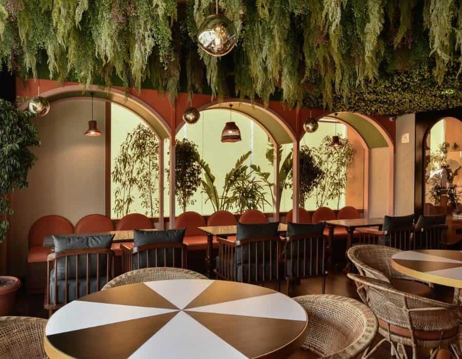
image credits: Saniya Kantawala Design
Good food and good ambiance is a good old winning formula. There is absolutely no alternative formed yet. Interior experts have upped the decor quotient by imbibing themes and trends that are nature adherent. Eleven 11 eatery in Ahmedabad designed by Saniya Kantawala is everything you are seeking from the scenic frame!
- The alfresco area of the bistro is made unique with a biophilic theme enabling a calming, serene experience. The lozenge-shaped windows bring in ample light and unsaid aesthetics.
- Natural material layers this decor predominantly. From teakwood tables, rust tone walls to cane furnishings, and walls, the decor appears rustic and earthy. All furnishing accents are handmade and sourced locally.
- Nature watches over you, literally. Plants hung from the ceiling makes one look up and take notice of the ceiling. Quite an eclectic touch to usual plain, beamed roofs!
House interiors by Tom and Danielle Raffield – Cornwall, England
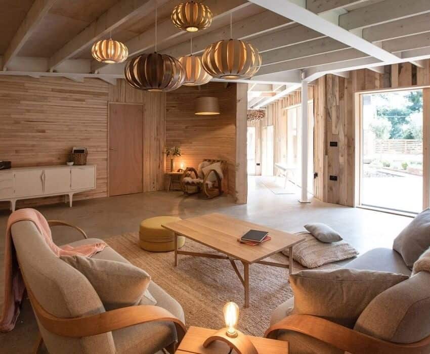
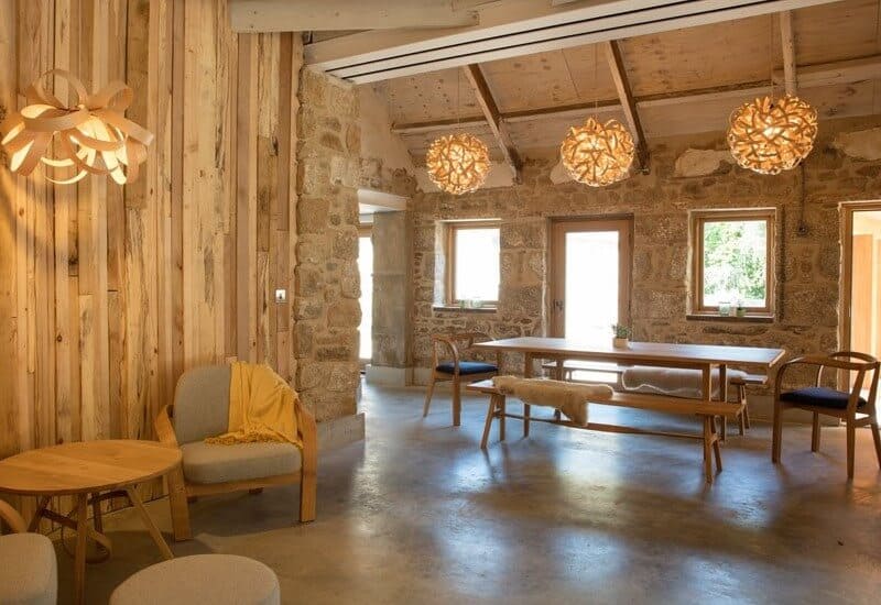
image credits: Tom Raffield
Straight lines take a backseat when drafting spaces that need a natural aura. Curves bend, and twist; make it look cultivated. Tom Raffield’s designs are sustainability personified that believes in twists and spiral molds quite unabashedly.
Opening the doors for nature to peek in, Tom and Danielle Raffield have created a space that lives, breathes, speaks nature in a wooden shade card!
- Beamed wooden ceilings, straight-line windows add an industrial bend to the home. The organic simplicity of nature plays a smart card with architectural innovations that play ‘honest meets edgy’ unwittingly.
- Wooden, natural stone wall panels add a nature for strength outlook. The horizontal, vertical sketch of wooden panels looks expressive. The coarseness of stones says everything has a raw side.
- Accents and accessories i.e. couch, pendant lights are raw and inspiring. Spirals, waves, arcs; it forms and deforms nature, portraying flexibility, and adaptability.
Svoya Studio – Ukraine
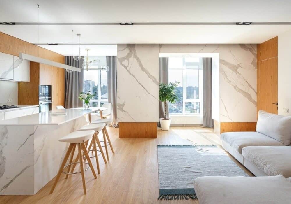
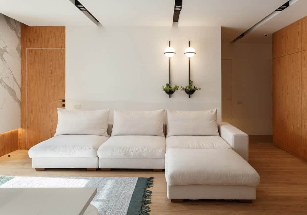
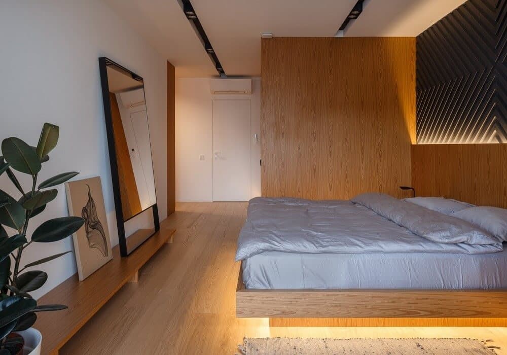
image credits: Svoya Studio
Comfort and cozy always tops the priority when designing family abode. Good banter, kids playing, entertaining guests, there’s a lot of hullabaloos gracing the home. Svoya Studio -Ukraine designed this levitation apartment bringing in the warm and cozy as a priority factor. Natural elements played the protagonist where cozy ALSO reads classy and chic!
- Wood and natural stone have a soft tactile. These are repeated quite generously i.e. wall panels, flooring, furnishing accents that help weave in the cozy factor.
- Colors are chic and understated. It complements the materials keeping it focussed and relaxed.
- Wide windows allow natural light to flow within the space. The home beams bright adding the bright hue to everything that needs focus and attention.
- A subtle hint of flora and fauna brings in color and zest. It makes a silent appearance to the corners, tabletop giving the space a ‘filling outlook’.
- The accessories i.e. woven rug, dhurries add a subtle hint of weaved organics. It complements the musky, wooden floorings pretty well!
Paul Uhlmann Architects – The Byron House, Australia
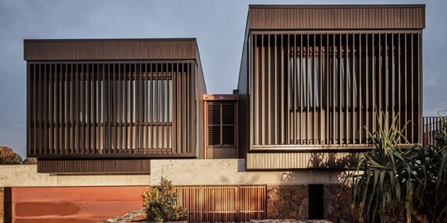
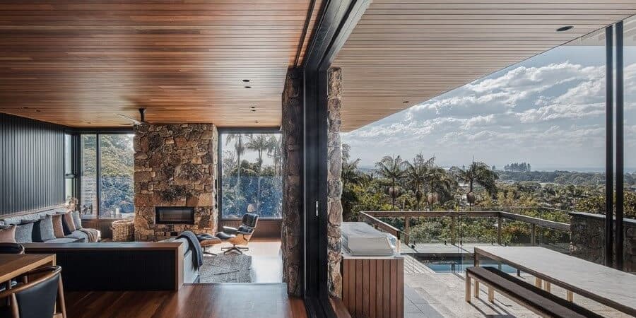
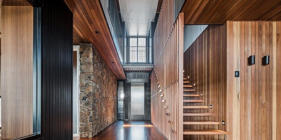
image credits: Paul Uhlmann Architects
When nature is as close as it gets, it’s imperative to showcase the love for it unabashedly. This family home in Byron Bay portrays everything and that. Designed by Paul Uhlmann Architects, the home looks edgy yet rooted. It’s chic, futuristic; made with nature that’s brown pigmented!
- Two louvered boxes carved from nature, that’s the first impression you get when you view the abode from the frontage.
- All main living spaces were arranged along a central spine that cascaded down the slope of the site, with the same earthy, natural materials used both internally and externally. This seamlessly paves the outdoor meets indoor route to enjoy the amazing shore climate!
- The design is ‘nature drafted’. Organic materials were added both internally, externally, and within the landscape that forms a parallel bond with the surrounding life.
- The wooden staircases area impresses with steps and walls forming a route to betterment anecdote.
Get inspired, by nature
Okay, the upper read may vouch for say no to fake cosmos, but building spaces inspired by nature is a good enough start. Representing nature in our art, wallpapers, or fabrics can give a certain amount of relaxing, calming benefits of the real deal.
So yes, adding the Himalayan landscape in the lobby or living room hurts no one either. If it’s soothing, uplifting, it’s gotta be near you!
Perini tiles- Paper 41 pro collection
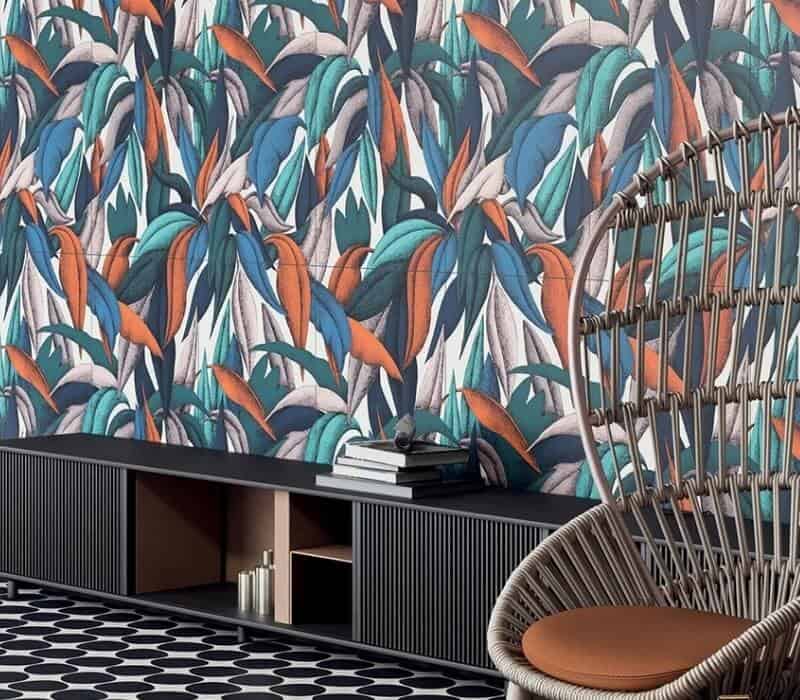
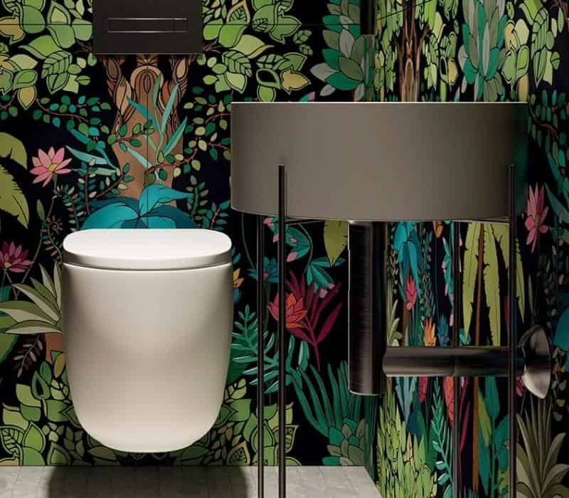
image credits: Perini Designs
Tiles seal the deal. Adding the porcelain sheen and layer on the walls has never been out of vogue. Plain, subtle to a theme inspired, tiles have evolved though, for good. Designer, high maintenance wallpapers may be a quick fix deal, but they lack the texture part. Tiles are tough and durable. Perini tiles- Paper 41 pro collection is inspired by nature. Vivid botanical imagery designs, this collection promises to add the ESCAPE TO THE WALLS touch to walls!
- Made using high definition digital ink, Paper 41 is a designer 3.5 mm thin porcelain panel, perfect to make ‘theme’ walls.
- Available in a stunning array of colors and patterns crafted exclusively for interior wall spaces.
Royal Fernery wallpapers – Cole & Son
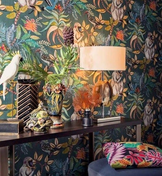
image credits: Martyn Bullar Designs
Designed by Martyn Lawrence Bullard, Royal fernery wallpaper collection is inspired by the Majorelle Gardens in Marrakesh. Each design has a woven tapestry-like feel that takes you back to visit the old archived French boulevard.
- Royal fern wallpapers are crafted to add an opulent feature in your decor.
- The clever hues like khaki, forest green, warm grey paint the leafy foliage, the candid way.
Our take
From reducing stress meter to adding the green aesthetics, nature adds the raw panache. The natural tint of green is still vastly underutilized. Going beyond the hint of nature i.e. balcony, lobby plants is necessary. The walls, the window sills even the cornered side table, deserves a green layer.
The biophilic design trend is not nascent, unheard anymore. Many interior spaces have put on this green sheen to showcase the NATURE IS WONDROUS side. The result held a calm and serene tag. Nature is forgiving, undemanding, and inspiring. It’s time we soothe the bruised earth and let the spaces hold a proud green badge!
Here are a few hand-picked articles for you to read next:
Check out our works on Instagram and Facebook
