[5 minutes read]
Quick links:
The right hue
It is the array of colors that makes such interior essentials look delectable and captivating. The body aka the outer appearance of a decor object dipped in an effervescent shade, appeals to the naked eyes. That’s the magic of colors!
An interior design blueprint and mood board is always bustling with imprints of colored pencils. It is painted pretty in an almost ‘decisive’ color palette.
An olive green or light amber accent wall? The woven jacquard upholstery, would it harmonize with the nude peach rug? There is this color tussle that makes any interior decor project a thorough stimulating chapter.
Colors are personal. Colors are preferential. Until a color palette fits the mold of a rough interior sketch, different shade cards sit patiently on the designer’s table!
Colors are chosen, already!
Some of the biggies are Pantone Color Institute, Sherwin-Williams, WGSN and a handful of influential style agencies. Also, there are several of the largest paint manufacturers who also choose their main, upcoming colors of the year.
Based on the ongoing, upcoming trends gracing the fashion, art, interior world, these color pundits select the color and shades of the year. These chosen shade cards are inspirational and influential for creative houses, design hubs to carve their future projects.
The 2020 color forecast is emblazoned already and the hues look stirring and rousing. The inspiration behind these chosen colors? Well, it’s directional and inspired by the sphere we inhabit.
Be it challenging the ‘on your toes’ digital lifestyle, the hunger to stay zenith or sometimes taking a sabbatical from the mad mad world, this color picks takes snippets from everything. Basic, Bold or Hush, the 2020 colors palette seems tantalizing.
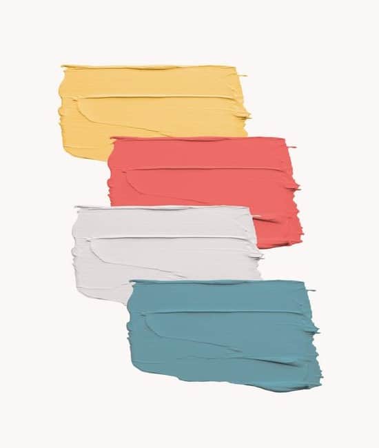
The pigment booklet
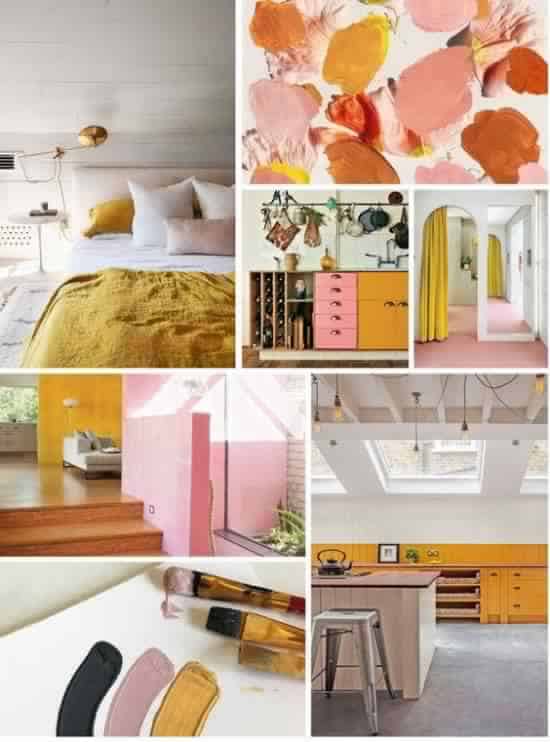
Honey Yellow
[metaslider id=8567]
The color yellow is cheery and inspiring. Funny, but there is no disappointment bone in this color! And, it never goes out of style. It gives a warmth aura in the summer and reminisces of sunny days.
Honey Yellow is an earthy shade, it features goldish tones that easily syncs in with the warm hues such as brown, green, red and other muted tones.
Interiors can dazzle in this 70s retro mustard tone, to portray an upbeat and playful vibe to any design project.
The shade is quintessential earth yard retro:
- Let the walls get drenched in some sunny inspiration or let the accent wall outshine with this mustard majestic.
- Accents and accessories; help them stand out with this musky tone. The floor lamp, center table, couch, mirror, keep it focused.
- Tiles, wall stencils, ceramic art, evoke alertness and warmth with bumblebee tinge.
Cantaloupe
[metaslider id=8571]
While orange is bold and poppy, cantaloupe is a silkier version of it. Cantaloupe is feminine yet daring. It’s a soft undertone of bright orange.
The color sits somewhere between the lighter shades of red and mellow yellow. It is an active shade that is inspiring, motivating and dashing.
And yes, this juicy color is starkly inspired by one of the most understated fruits, the melon! Notice the milky and soft shade of it, next time you grab a piece!
- The infamous pastel tones, they somewhat bracket themselves in gender stereotypes but trust orange hues to add a punchier protest. When muted hues seem ho-hum, add easy accents like cantaloupe ottoman, side table, accent chairs to kick in some fun.
- Cantaloupe is soft and sweet. It embraces an earthy nature outlook. It’s a perfect tone to set up an area that could use some individuality i.e. bath space, corridor.
- This shade shares a close resemblance to the two trending colors trend- pastel color trend and the earthy tones. Upholstery, rugs, planters are easy ways to induce this delectable shade.
Terracotta
[metaslider id=8575]
Being nature conscious is an ‘it’ thing now. A similar ideology gets followed in art, fashion, and interiors. Portraying awareness through rich earthy tones is a rage now.
Terracotta color is the epitome of being humble and staying grounded. It’s also used to describe the natural brown-orange color of terracotta products. The earthenware ceramics, they look their best in this brick, real mud color.
- Terracotta is a go-to shade for earthy accessories i.e. planters, pots, oversized deco ceramics, sculptures.
- This earthy tone is open, welcoming and warm. A perfect addition to the wall, window panels.
- It’s a warm spring-like color that is giving some major inspiration to furniture accents. From couch to lounge table, this shade induces earthly emotions.
Neo-mint
[metaslider id=8579]
The color Neo-Mint is an effervescent addition to the color palette 2020. It looks robot-like and futuristic. The color is very millennial pink and evolves from the popularity of soft pastels trend.
Gone are the days when colors were portrayed as typecast shades – bring hues to showcase youth and soft pastels being a feminine domain.
Today colors bring in an inclusive approach where the blinds of color restrictions are removed for good. The Neo-Mint embodies a progressive thinking and utopian optimism.
From Tokyo’s Olympics to NASA’s Mars Rover, this futuristic color binds the present and future chapters together.
- Primal furnishing accents in neo-mint tone can influence excitement in all pastel interiors.
- Easy neo-print accessories like rugs, pillows, and ceramics add a fresh infusion to existing decor.
- A solo deco art in the neon-mint shade is enough to make a big noise in on walls, corners or ceiling .i.e. a canvas art, pendant light, tabletop platter.
Purist Blue
[metaslider id=8583]
The sea is mystical and the sky is vast and dreamy. These nature marvels remain the icons of desire and inspiration, hands down. Blue is simply not a tone in color chart but it’s an emotion in its own right. Blue is cool, crisp and contemporary.
Blue is not a typical shade that represents the warmth of red and yellow. In fact, it may appear downright cold, passive and serious. But different shades of blue i.e. purist blue invokes closeness to subtlety and understated serenity.
A lot of interior brands are now diluting their blues to evoke more closeness.
- Blue is the color of power. For many decades blue acted as a go-to color to represent ‘heaven meets earth’ metaphor in paintings and murals. The shade now paints the entire interior in surreal blue.
- The tone represents peace, meditation, and escapism. A reading corner, dainty office set up can be designed in this soul-enriching shade.
Cassis
[metaslider id=8587]
Pink being a feminine color is history now. It’s now a gender-neutral hue that looks flamboyant and feisty. It is suggestive and draws attention pretty instantly.
An interesting entrant, Berry-like Cassis is a direct play on both millennial pink and lilac that is making a definite wave in the interior sphere.
The shade has been embraced in many European, American and Asian interior projects.
- Cassis taps into both pink and purple tones. The Purple color sharing historic connotations with royalty, the tone evokes feelings of opulence and decadence. The walls, plush furnishings, upholstery can appear royal and regal.
- Nature inspires and how. From crushed blackcurrant to rich aubergine, the understated cassis draws inspiration from nature that is real, mystical and dreamy.
- Elegant Cassis represents taste, color and wealth. This tone makes a perfect choice for the plush boutique, design house, retro cafe decor.
Classic Blue
[metaslider id=8591]
Nothing beats a classic blue hue. It’s an enduring and timeless shade that makes you stand and take notice.
PANTONE 19-4052 Classic Blue is basic, simple yet elegant. This shade is a fine reminder of the sky at dusk. It highlights a longing desire to form a stable foundation on something pure, calm yet engaging tone.
The classic blue is vintage yet new, making any decor appear collected. It’s poised and personal.
- Blue calms the nerves. PANTONE 19-4052 Classic Blue brings a sense of tranquillity that detaches one from the cacophony. It offers refuge and surrealism. Perfect to spruce-up ‘me’ corner.
- No cliché here, but this shade is thought-provoking and brings in laser-like clarity. It’s an inspirational color. This tone is perfect for creative joints, artists’ den/studio decor.
- The shade is humble and honest. It fosters resilience. We now live in an era where technology has blanketed our entire existence. Is there an escape, to break the shackles of demanding race? The answer is mostly foggy. No wonder, we take solace to such colors that are honest and promise a protection shield.
- The PANTONE 19-4052 Classic Blue is relatable. It’s an easy and interactive shade. It promises an assurance of a better tomorrow.
Our take
Agreed, colors are personal and subjective. In the end, the individual preference reigns supreme. The 2020 color palette looks inclusive and interesting.
Bumblebee yellow or delectable cassis, we say the 2020 shade card needs a definite place on the mood board!
Check out our works on Instagram and Facebook
