[5 minutes read]
Quick links:
The color saga
A home decor project is just like a fresh canvas. All white and pristine.
Be it sprucing up the never-touched condo or refurbishing an old apartment with major architectural elements, the journey always starts with infusing ‘different colors’.
Adding different arrays of colors comes naturally to us. Colors hold that power of attracting the naked eyes.
No wonder when you enter the home decor store, colorful pillows, color-blasted hand-woven dhurries and even that dainty tabletop Buddha figurine that is often crafted in turquoise blue, catches your fancy!
Needless to say, the typical design advice of adding ‘many colors only’ can make a home decor look alive and exciting, often gets reflected in many interior projects.
Agreed, adding different arrays of colors in interiors has a vibrancy of its own but let’s not underestimate the solo color tone.
Choosing a single color and playing with different hues to spruce up the decor, is one eclectic style!
One tone interior: it works and how
Will the blue drapes match the olive green couch? And that, ‘traditional’ chestnut storage chest, hope it will harmonize with the flokati rug which is all white and furry.
These are the common ‘color tussle’ or dilemmas when you design the space with ‘no specific color’ scheme or coordinated color palette.
There is a lot of ‘color storming’ that goes in there when you have many colors spreads set on the table!
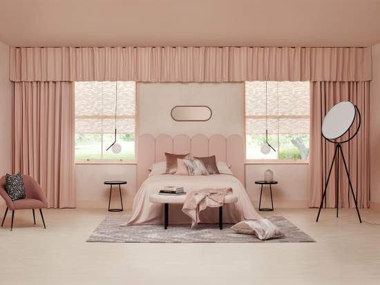
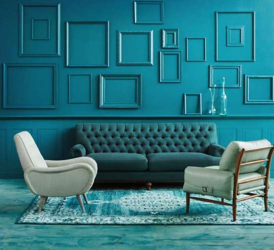
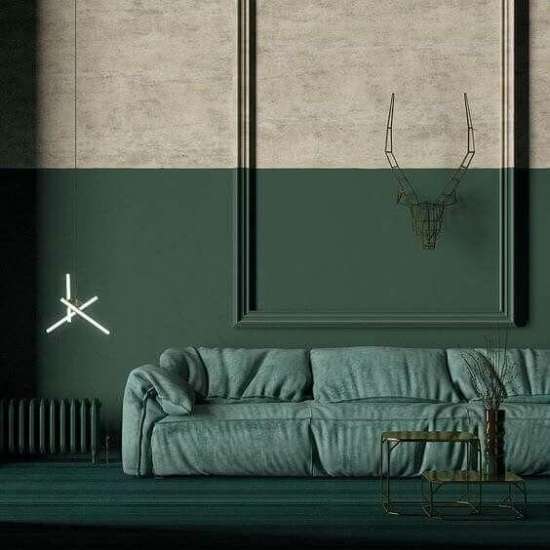
But, not when you do a monochromatic interior. Because using different hues or shades of the same color, streamlines your decor here.
There is an ‘unspoken variety’ in a monochromatic color scheme. It portrays unity and harmony with just a single tone color thread!
Want to know about Chalk Paint? Read our blog Chalk Paint-10 common questions answered to get an in-depth idea about it.
How to get started with one tone color scheme
Acing the monochromatic color scheme may seem like a bit intimidating. Trust us, the outcome of this understated color play is surreal and magnificent.
The monochromatic home decor is refreshingly edgy, understated, modern and bold.
Wondering how to get going on this solo hue journey? Which colors to stick to? And, what if the color restriction code ends up giving the decor ‘stagnant’ feel?
Woahh… Valid questions, indeed. But we have got your back here.
Use these guidelines to ace the one tone interior with elegant panache:
1. Choosing the color palette
Let us get to understand the basic terminology of color
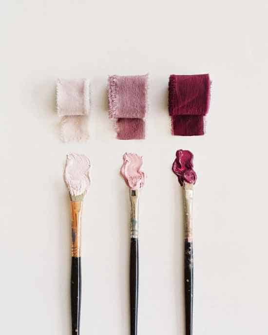
- What is Color? – Quality with respect to light reflected by the object. We refer to colors as ‘Green’ or ‘Red’. Ideally, one should freeze a color, to begin with.
- What is a Tint?– The tint is a color after white is added to it. We usually prefer Tints for wall color, ceiling color.
- What is a Shade? The shade is a color after the addition of black to it. Shades are highly recommended for furniture, upholstery, and decor.
- What is the Tone? The tone is a color after gray has been added to it. We prefer tones for wall art, lights, lampshades, rugs, etc. Monochromatic interiors depend upon the ability to explore the depth of the color by choosing a range of tones, shades, and tints of the same color.
2. Think small
[metaslider id=”7941″]
Try designing the small areas first i.e. reading corner, porch, and corridor. Stick to one shade only.
We say, take baby steps. The living room, bedroom, and even a home office set-up often have large dimensions, so crafting the one tone decor for the very first time may leave you color confused.
Simply because of the area will be huge and you may end up utilizing all the decor ideas at one end, wondering how to spruce up the remaining pie!
- Start with small areas/room first i.e. the reading corner, porch, bathroom, etc. The area here will be confined and good enough to think from a single tone decor point.
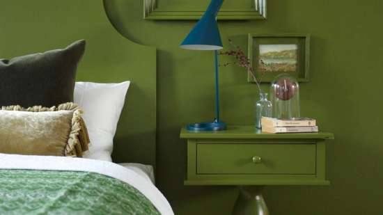
- Choose a color matching the overall vibe of the space. Take fire mantle, reading or dainty little corner of the home where you unwind, read and relax. As space demands a relaxing vibe, think of adding a soothing color. Green, blue, white are some of the go-to colors when you want the area to have a calming effect.
- Once you zeroed on a color i.e. green, add tones and shades of the same color. Forest, hunter, olive green, to name a few. Let the adjacent wall, furnishings, and accessories get bathed in a green palette!
- Add a hint of ‘different color’ if the ‘green’ corner starts feeling too forest-like. Dainty tabletop accessories, rugs in poppy colors can fit the bill then!
3. Add textures and patterns
When in doubt, add textures and patterns. Since there is an obvious restriction to infuse different colors, add different textures and patterns instead.
It will help add much-needed visual interest. Wood, metal, fur and even vinyl, keep the textures interesting.
And patterns? Floral, stripes, Aztec, keep it personal.
- Create interest with decorative accents. Side tables, wall mount/tabletop accessories are some of the fun ways where you could add varied textures. Metal coffee/side table, ceramic vase, rustic-metal pendant lights, etc can keep the home decor texture-enriched and chic.
- Keep the furniture accents interesting. Living room couch, wingchairs, ottomans are some of the furniture accents where you can add ‘distinctness’ via fabrics. Choose from cotton, linen, velvet or suede, as the feel of these upholstery fabrics makes the decor look thoughtful.
- Let the decor be pattern enriched. Choose the upholstery, accessories engaging with prints and patterns. Plain, subtle print or print galore, you choose. I.e. couch upholstery, pillows, throws, and area rug, let there be a variety in pattern and prints, all in a similar hue, shade.
4. The ‘neutral’ choice
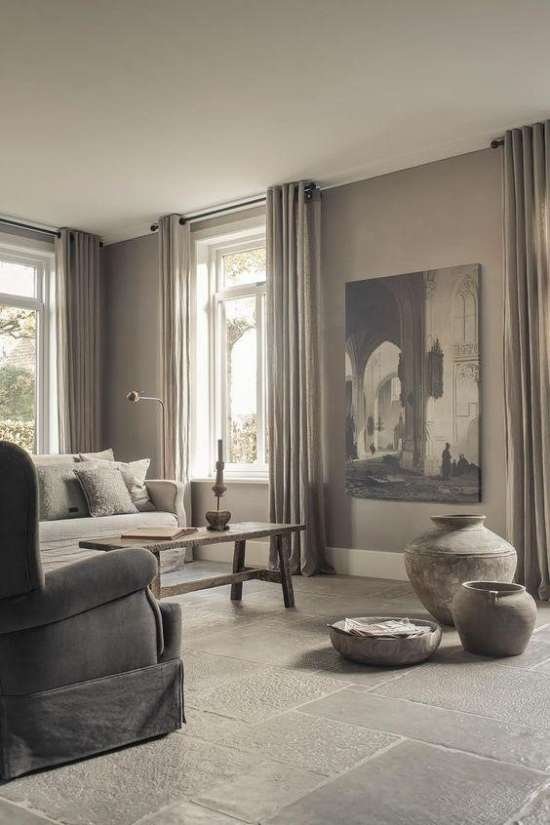
White, gray, mauve and more, trust neutrals when getting to know the monochromatic color scheme. It’s an easy color hack for those who are not ready to dive into the daring color pool of blacks, maroon and glitzy silver!
- Neutral tones add subtlety and calmness in a room. The entire area gets an ‘understated’ vibe when all neutral tones of the same color are added.
- The biggest advantage of adding neutrals? You can add a hint of poppy color into the same to infuse excitement. I.e. all beige living room could do well with indoor plants or succulents on the side table!
5. Play the game of ‘contrast’
If you think a solo color interior is getting drenched away too much in a single hue, fret not. There is always a color rescue palette.
Yes, the contrasting colors. They come handy when everything looks matchy-matchy.
- It’s ok to bend the strict rule of ‘one tone only’ whenever it the same color decor feels too overwhelming or downright boring.
- Adding a contrast tone is a fun way to break the color monotony. It helps enliven the entire area/space.
- Let different colors peek in. A statement figurine, printed upholstery couch or colorful Persian rug on the floor are some of the ‘quirky’ ways to infuse colors, that portraits ‘a little bit of color don’t hurt either’ motto.
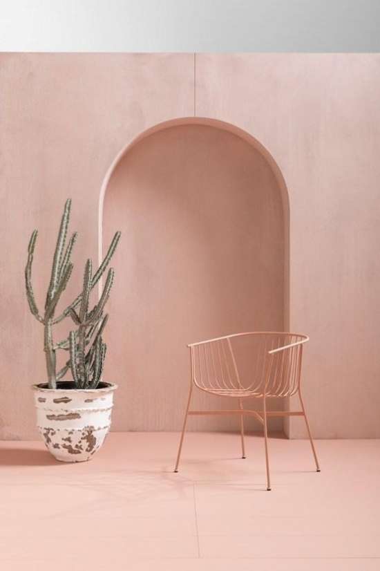
6. Go bold
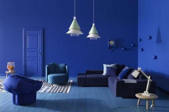
Keep the colors vibrant and daring. Orange, green, blue, choose the shade that says ‘playful’.
Walls and flooring, when painted in bold colors, gives a vibe of instant ‘aliveness’.Go bold everywhere.
Add accessories and furnishings which perfectly complement the ‘engaging’ vibe of bold tint room. Play with patterns and textures of decor accessories.
The returns aka the benefits
Put on those creative glasses and view the monochromatic interior as a color challenge. ‘Thoughtful creativity’ simply starts shaping better and better.
- The walls, the furniture accents, accessories – painting them all in a single hue gives the home decor a unique personality.
- Since the focus is on ‘one color only’, there are no color distractions here. Explore the tones, tints, and shades of the color.
- If there is one word to describe the monochromatic style, it’s ‘chic’.
We, at Alcove Studio, simply love the monochromatic color scheme. Guard this one-tone guide and paint your next decor project as we do!
You will love it too!
Check out our works on Instagram and Facebook

