Looking for some great wall art ideas?
We have listed below 5 easy steps for choosing the right & the best wall art for your rooms.
Here we go:
1. Agree on the narrative of your house
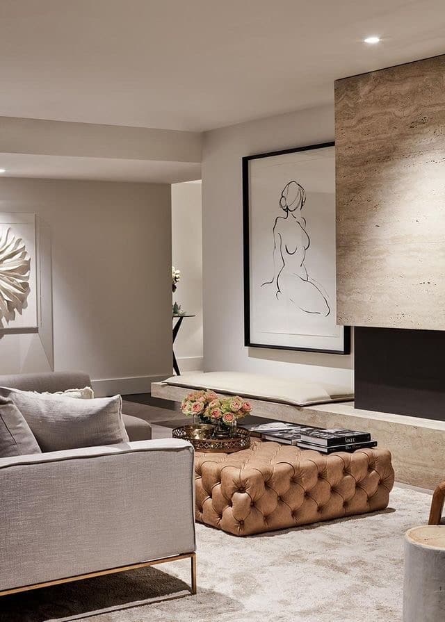
Every house has a narrative. However, during the process of designing the perfect home interiors and obsessing over deadlines, couples often muddle up the narrative; the picture of their ultimate dream house becomes somewhat hazy.
The idea is to clearly define what your house is and what it is not. You don’t want to put ethnic Shree Nathji paintings or Tanjore art in Zen and modern interior designed home.
For a coastal style home, I would suggest you add some wall art with corals sea waves, beachside vibes, seashells. There could be a bit of contrast but keeping the narrative intact helps in setting the right vibe for your home.
2. Narrow down the walls
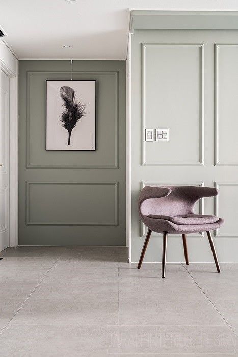
Once you have the story nailed down, it is time to identify the spaces where you want to put the paintings. Based on the layout of the house, there will be spaces you want to highlight.
3. Big or small, one or many?
Some type of wall arts and how they are best suited.
-
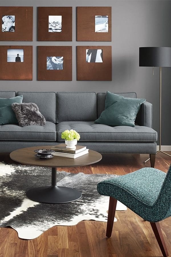
- Landscape or Portrait Orientation – If the wall is narrow, I generally like to use a wall decor with a portrait orientation. I like to team up a set of 6 small or mini wall art pieces.
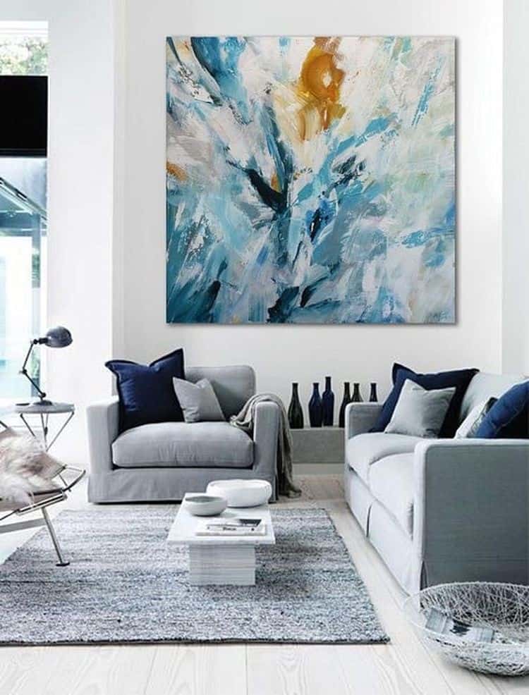
- Oversized Wall art (more than or equal to 100 cms) fit well in large spaces like the living and dining room. These pieces act as the focal point and make a statement.
A word of caution here: measure up the wall before buying such an art, one is enough per room.
- Large and Medium wall art (60-100 cms) are usually safe bets and help maintain balance. These pieces can be used in isolation or grouped together based on the wall size.
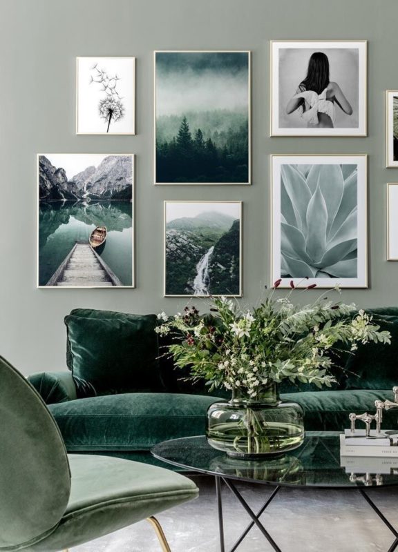
- Small and Mini wall art (25-59 cms) are best suited to be grouped in pairs of three, four or six. Ideal for passage, above bookshelves or console units.
General thumb rules:
When pairing art pieces, the work of the same artist is highly recommended.
When placing art over furniture, maintain at least 20 cms from the furniture.
Art size should not exceed 2/3rd of the length of furniture.
4. Filter colour, mix match – in the end, it should all make sense!
Personally, I have two broad approaches and it has worked well for me :
i. If the room is colourful and bright, I choose subtle shades or introduce 1-2 dominant colours already present in the room to maintain the colourful vibe of the room. I prefer to use grey paintings or pencil sketches or black-white photos if I feel there is a need to balance the business of the room.
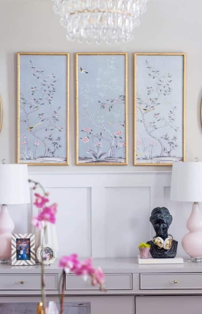
ii. If the room has pastel shades, greyish and subtle tones, I choose to add some pop by introducing one bold colour through paintings. In an industrial interior design home, I would like to add pop by introducing a neon, blue or deep pink colour artwork.
Some pointers to kind in mind:
- Wall art colour is also dependent on the colour of the wall. Most artworks go well with nude colour walls. If there is a nice wallpaper or a classy wall texture in your space, I would suggest going for artwork that is not too big and has simple shades to avoid taking the eye away from the wall.
- Frames can be used for introducing texture and colour. My go-to framing style is using brass and golden metallic frames to complete the mid-century modern wall decor.
5. Choose art with heart
I generally advise my clients to talk to the artist, understand their vision, technique and try connecting the dots. Most importantly, you should fall in love with the piece. It should either relax you or bring enjoyment.
To date, there are certain pieces that hold my attention, remind me of the time I bought it and the painter’s word on its origin. Right art selection is very elemental in provoking conversations.
A friend once asked me about this painting which hangs on my office wall. I bought this painting of a seaside market from a street vendor in Thailand. The lady was winding up and all set to leave home and I just saw some colours on a canvas which I wanted to re-examine. When I saw this piece, it was the kind of blue I knew would brighten up my vintage style interior designed office. There were calm, peace and a message which struck a chord with me. I could clearly visualize where I wanted to place it, how I wanted to frame it. That’s how I purchased it. The lady and I became friends by the end of our deal. She treated me with a scoop of homemade coconut ice-cream.
I feel wall art is the medium of expression which beautifully fuses colour, texture, and content. Mix and match paintings, murals, ceramics, sculptures, fabrics to level up your wall decor.
Don’t fret to experiment. Life is too short for boring walls!
Some websites we highly recommend are Eikowa, Floating Canvas, Saatchi art and Saffronart.
Alcove Studio provides architecture and interior design services. Our office is based in Mumbai, India.
Check out our works on Facebook, Instagram, Pinterest

