[7 minutes read]
Quick links:
- The Alcove Studio design abode
- The space talk
- The rough sketch aka inspiration
- Influence is good
- The inspiration board
- The studio at work
- The detail game
- The upshot: when design speaks
The Alcove Studio design abode
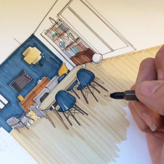
I don’t know who quoted this line but it stayed with me as it underlines a journey of creativity. I knew I would be designing homes one day and I did just that!
Alcove studio is a proud passion of mine where ideas get transformed into reality.
From developing a charcoal sketch of spaces to adjusting the pleats of the couch throw, there is never a dull day in our design studio and the creative brainstorming, it gets more stimulating over that next round of coffee!
As our office space lives and breathes the journey of different homes and spaces daily, it was time, it got a shiny, new frame of its own. Designing the Alcove studio- it had an exciting ring to it.
The space talk
For starters, the office space is 140 sq feet, yes, it’s small, so working within a prerequisite outline was always there. But, here’s the thing about designing small spaces, it challenges you to design a blueprint that says size doesn’t matter, artistry does!
- The obvious priority was to bring in the illusion of – the space looks bigger and functional enough for a design team to work in an area that doesn’t appear like a cramped box. With creative hands, comes lots of reference books, pinboard flooded with pushpins and sketch pads drenched with sample designs. To fit in all these creative branches by giving it SPACE? hmm, challenge accepted.
- Oh, did I mention the space is rented? That means space shouldn’t leave major marks and scars on it. Bulky and sturdy accents? They often come with a label of ‘permanency’. That won’t work either.
- The studio needed to look adaptive and flexible. So, I played ‘mobile’. Easily installed furniture modules were to be used without any permanent fixing on the walls. The prominent sliding window floods the room with natural light making the room look spacious.
- Yes, folks, let’s make a budget talk. Mine was $ 2000 to take the studio design journey from 0 to 100.
The rough sketch aka inspiration
[metaslider id=”8217″]
All you ever need is a page of thoughts, rest follows. Mine was bustling with raw ideas and inspirations.
The studio is ME
Before getting started with the studio design, I was sure about a primal facet of space impression: The studio design to be a reflection of me. It should ooze my personality and design sensibilities.
The clean sweep
I, as a person, always admire ‘minimalism’ in everything. Clean design, understated outline have this natural penchant of saying volumes without stating the ‘obvious’. I like it when a piece of furniture or tabletop accessory projects just that.
Balance with asymmetry
The asymmetry design technique sounds complicated to pull off but ends up giving some breathtaking results. To create balance and harmony by juxtaposing designs that don’t mirror each other sounds like a fine design challenge. That had it. The studio should possess a hint of asymmetry.
Let’s play pop on neutral
A neutral canvas takes it all. A dash of pop, prints, and sequins, neutrals never say no. It’s forgiving and accommodative that way. The studio with a fresh coat of neutral, the design vision was blur no more.
The cozy setup
Gone are the days when creativity meant building something by solitude. Not anymore. The more ideas, opinions flown in, the design blueprint gets yet another facet, raw and thought enriched.
As long as my experience goes, I can firmly say that designing a home or workspace is a group exercise. Right from kids to grandparents, everyone is involved and they love to meet me in person in the studio.
Seeing the meet and greet the interior expert trend not losing its sheen, I felt the studio should portray warm and cozy. The studio design shouldn’t be age-restricted but would appeal to everyone.
And there it was. My first design draft was ready. It read – An ultra-chic space with a clean, streamlined aesthetic, asymmetry and pop on a neutral canvas.
Influence is good
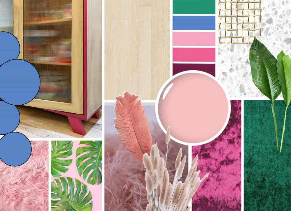
An ultra-chic and minimal design often has an unsaid tag to it that says, calm and creative. And, I needed that same calm vibe to reflect in my work too.
At the same time, I wanted to add a wagon of modernity. Mid-Century Modern style, yes, it fitted the bill! I found the missing piece!
Mid Century Modern means clean lines, gentle organic curves and showcasing the love for different materials, I could visualize the studio design outlining just that.
- That led to playing with form and texture. Trending materials like terrazzo, leather, velvet, feather, fur with a hint of gold were used extensively.
- The color palette got zeroed on chic, millennial pink.
- For the add-ons, lots of green accents and accessories were added. It looked pretty organic and not a deliberate, forced attempt.
The inspiration board
We at Alcove, swear by the mood board. Writing a couple of ideas, lines, and designs and we are all sorted.
The division of space and the overall outlook of design get crystal clarity then. And images? Just 1-2 images are enough to build excitement.
So, anyone with a rough idea of design, follow the mood board. Trust me, your designs will flair for better.
The studio at work
[metaslider id=”8099″]
It’s a surreal experience when a rough design created by you gets finesse. It shines just like a new penny.
But, the shimmer doesn’t come easy. There is a lot of prep that goes into it. Be it scraping, polishing a statement table or choosing a wall a hue from a shade card spread, I lived, breathed it all.
Some tried before design rules and some straight out of reference books, the studio mood board had a new pinned idea every single day. Blame it on designing being a simulative process!
And oh, I must mention the wall panel detailing here. Making it look frame perfect had me climb the table umpteenth times, but it was totally worth it!
The detailed game
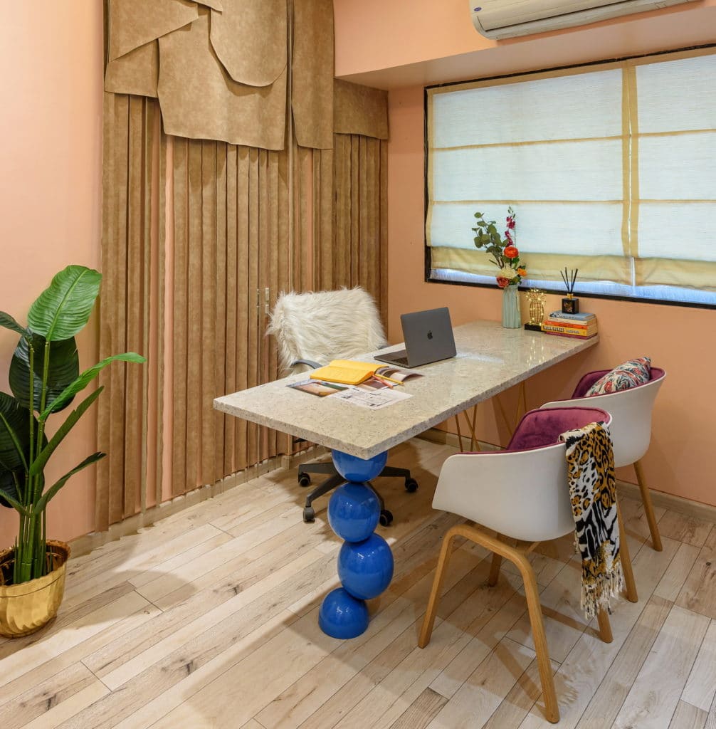
The space planning, the layouts or added molds may shape up a decor project but it is the decor that steals the show in the end.
The decor topped the list in our studio design sheet. There was so much to do. I had to ace-up the design game all in a budget of $2000.
The decor book
I must confess, I am quite a detail hoarder when it comes to decor. I spent quite a time curating the accents and accessories from all over the world. Here’s my search and research for decor, anyone who wants to add chic meets classic to their space, feel free to get inspired:
The wall backdrop
Never leave the walls alone and boring. True dat. I wanted the wall to speak up more than a fresh coat of paint or canvas art. So I chose faux leather for a wall backdrop.
It’s a fine layering of neutral rustic faux leather that has an old-world charm. As the fringes and detailing are so much in vogue today, the layering of leather gives a similar vibe here. The leather has an imperfect finish (smooth is passé’) that looks texture personified. And, the fine layer of the same brings in-depth to the wall behind.
Flooring
The base had to look firm and grounded. I choose Pergo wooden flooring. The plank style, matt oak flooring gives the space a solid and secure look.
The table talk
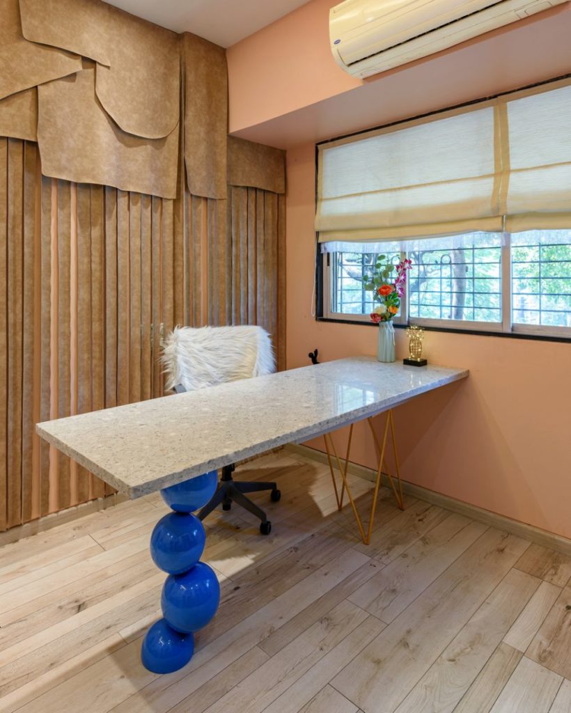
The work gets done on the table. I wanted it to be a conversation starter. The statement terrazzo table with asymmetrical legs with a splash of bold blue and hint of gold fitted stood firm and good.
Sit pretty
Designing is a long hrs job. A comfy chair makes it bearable. Here, my chair is cloaked in a faux fur throw, making it look effortlessly chic.
Colour palette
Pink is chic and works quite well in a minimalist interior. The walls look serene and understated. Brass decor accents complement the muted color palette pretty well. The greens add a touch of noted serenity and excitement.
Curtains
I simply love linen as an ‘earthy material’. The beige linen curtains with fringes have an ethereal feel to it. They soften up the room instantly. Trendy and classy!
Storage Unit
Distressed and weathered look always wins, especially in furniture accents. I chose this distressed touch of Annie Sloan to paint with a fusion of flute glass. It got a definite outline aka the border with a pop of deep pink from Asian paints.
Click here to read more about Chalk Paint
The noteworthy
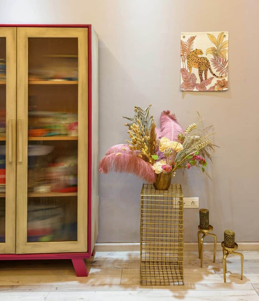
Wall art – Cheetah Canvas print on the wall says flora and fauna design is forever. It adds a quirky vibe to the wall. We sourced it from a local art gallery in Cape Town.
Brass Candle Stands is a clever addition to spruce up the corner. Pretty earthy and chic.
Trust greens when inducing life and energy to the workspace. Succulents and greens add a tropical vibe. We sourced it from Asos, IKEA, and four walls, urban outfitters.
Planters – Brass, porcelain vases topped the choice. The gold wireframe table supporting the planter ups the glam meter.
Floral Arrangement – Occasional flamboyance works, every time. Flowers and feathers, why not? We sourced ostrich Feathers and bunny tail from Etsy, a lot of other botanicals were sourced locally.
Printed linens – Color-enriched throws compliments the chair and ottoman effortlessly.
A dainty pineapple light on our tabletop brings in luminous shine, sourced from Asos.
Bag stands are handy and crafty, from Asos.
The upshot: when design speaks
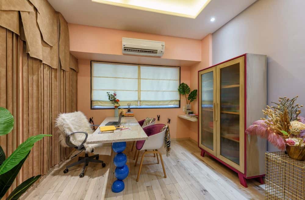
The studio design was complete and I must say, I fell in love with my work all over again! Here are some of the early accolades received when I finally opened the doors of freshly styled Alcove studio:
“Love the chic, blush and brassy vibe of the studio. It proves that sticking to a tight color palette is anything but restrictive. It opens up doors of creativity. The wall decor and accessories have a unique quirk of their own.”
“Carefully curated Accessories make everything better. We can feel the designer’s style is reflected everywhere. Super chic and classy.”
“The studio is a calm den. The soft pastels add ease and serenity to it, the same kind of feeling when a designer shoe fits like a glove. Love the velvet chairs, uber chic indeed.”
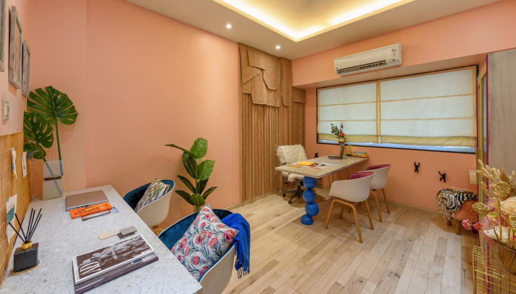
Our newly designed studio office is ready to meet, greet and create designs. Drop in to say hello!
Check out our works on Instagram and Facebook
Here are a few hand-picked articles for you to read next:
