[5 minutes read]
Quick links:
- What is Lozenge Interior Design?
- The predictable poker-straight game
- Curves are good
- Lozenge: The most ‘understated’ curve
- The lozenge avant-gardist
- The lozenge design – tried and portrayed
- Hawa Beirut by Richard Yasmine
- 2 LG studio
- Breadway Bakery
- Pink Zebra
- The Budapest Café
- Say yes to curves
Let us first understand:
What is Lozenge Interior Design?
In simple words, Lozenge interior design, also known as pill-shaped interior design is the use of a pill or soft arch-shaped structure in interior decors, like for furniture.
It is embracing soft curves with rounded pill-like shapes in order to dominate the interiors. The Lozenge shape shares similarities with the archway, which is a popular shape within Architecture and product design.
The predictable poker-straight game
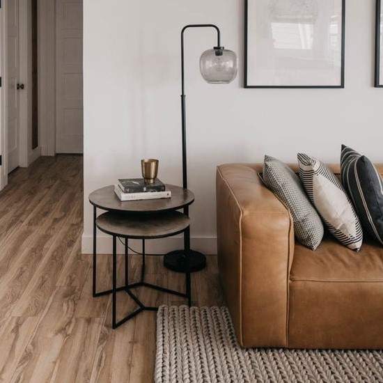
Cliché but a home often looks like a confined square box. Wondering why? Look around any home decor.
The square table, rectangular couch and even those hand-painted wall tiles, all have this poker-straight appeal that ends up looking quite ‘ruralry’. The decor then appears like a sharp edge story. All straight lines. No curves.
Curves are good
[metaslider id=”7973″]
Interiors love geometry like no other. The round, the arch, the scallops, the interest sneak in when the door of shapes gets opened.
Geometry is funny that way and when incorporated in interior designing, produces some dramatic effect for sure.
Be it circles, swirls or scallops, curves help balance out the sharp portrayal of home decor.
The verdict: Embrace the soft curves, they ain’t hurt nobody!
Lozenge: The most ‘understated’ curve
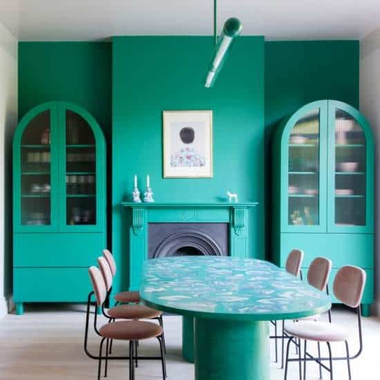
A round pill like shape that shares similarities with the archway, the lozenge shape has been the chosen contour in all major bygone era art deco motifs. The lozenge shape has always been regal that way.
The pill shape has an unspoken glory about it as it epitomizes the blend of modern meets sensual. The lozenge shape when applied on any scale of application, simply speaks ‘regal’.
2018 witnessed a lot of pill shape within the architecture and product design and seems like the curves are here to stay forever! The lozenge journey continues to dominate the interior sphere in 2019 too.
The unconventional pill shape, in its balanced application, is known to shine the ‘interior game’. It’s fun, bold, eclectic yet calming.
Be it wall paneling, sturdy bookcase or light metal side table, the pill shape is an ultimate ‘shapeshifter’. It looks good on anything and anywhere!
The lozenge avant-gardist
The lozenge inspired decor has been inspiring and dominating the art and architectural domain since medieval times. The trend’s been here forever, the need to evoke it in a better avatar made it make a quirky comeback.
Thank heavens for that curvy turn!
[metaslider id=”7979″]
They say a good story and a good film set to stay forever with you. The year 2015 was all that and more. The bubblegum pink never looked better before.
Wes Anderson, the American film director created the most ‘pink’ interiors of all time – The Grand Budapest Hotel suites is still a work of delectable envy.
The set designs of this academy’s favorite flick were downright inspired by Art Nouveau and Art Deco architectural elements. The archway passages meeting the bar area, entrance and even the luggage trolley of this ‘pink is chic’ interiors showcased that geometry meets symmetry is good for design’s sake.
Since then, the pill/lozenge shape design trend has never looked back and many designers have embraced this curvy design trend which is outlandish, in a good way.
The lozenge design – tried and portrayed
Hawa Beirut by Richard Yasmine
[metaslider id=8034]
The Lebanese architecture has always been inspired by the mystical lozenge; the window panels, the doorways, our love for the arched curves been there forever. Richard Yasmine, a Lebanese interior architect, and product designer stands by his design statement and native love for curves!
HAWA BEIRUT, his collection of very light and airy furniture is heavy ‘lozenge’ inspired. The chairs, the mirror, the center/coffee tables, all are crafted in pill shape but have his distinct originality to them.
The different scales and proportions of lozenge used to craft this furniture range is a fine balance of classic and chic.
The entire collection beams in pastel hues and tints.
The fabric, upholstery and added cords and tassels are all ‘pastels personified’ that make this unique shape stand out even better!
2 LG Studio
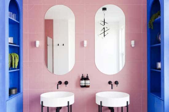
The return of the pill shape can be found in 2LG Studio’s designs in the chicest way possible. The creative duo Jordan Cluroe and Russell Whitehead vouch by “minimal doesn’t have to mean just a white box, just as lux does not symbolize going blingy all the way”. True dat.
Their designs sit perfectly well with the ideology they swear by!
The brand uses this effervescent shape quite lavishly in many of their projects. They insist that be it chairs, the dining table, glass cabinets; the furniture accents shaped the ‘pill’ way makes any square room appear curvaceous pretty instantly.
And when you add bold hues or pastels to it, the accents and accessories appear distinct and glace-worthy.
Breadway Bakery in Odessa, Ukraine

The project Broadway bakery needed to be warm and inviting. It screamed for that change which was not boxy, just like those pastry boxes!
The arch-like lozenge fit the bill as the architect experts Lera Brumina and Artem Trigubchak wanted the overall vibe of the cafe to be warm and memorable. It shares quite a resemblance to a popular film by Wes Anderson which was ‘unapologetically pink’.
Be it the arched banquette seating or doorway leading to WC, the lozenge geometry can be explored everywhere in this ‘coral pink’ cafe. The flirty toned pink seating perfectly complements the grey subway tiles and copper tone wall panels here.
The color game of lush neutrals meeting the cooper dazzle wants you to sit and take notice!
Pink Zebra, Kanpur India
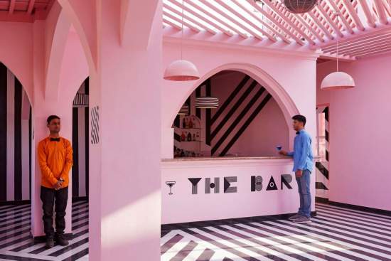
Looks like the Wes Anderson inspired decor continues to shine ‘pink’ and how. This great bubblegum shade of the grand Budapest hotel is not fading a bit for sure.
Pink Zebra in Kanpur India designed by studiorenesa is so Anderson inspired! The client wanted the filmmaker’s quirky yet tasteful ideology and it got just that, even better.
The black stripes splashed all over the pink canvas are chic and hand down quirky!
The love for unconventional symmetry and a restricted color palette made this decor look crafting extravagance through minimalism! The nosedive arches and molded panels never looked more British before.
The Budapest Café in Chengdu, China
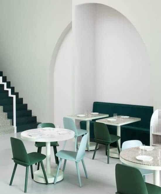
The quirky symmetry and flamboyant color palette, the Budapest cafe in Chengdu, China is yet another cafe that speaks the classic Wes Anderson style.
The Melbourne based studio Biasol has done a stupendous job in designing the cafe that speaks serenity and calmness. The idea behind the very decor was to create a space for all those who love and appreciate the cafe culture. The usual banter over a cuppa coffee!
Right from the archway which takes you inside this mystical cafe to the decor mirror that ups the restroom decor, everything speaks lozenge.
The heritage arches are showcased via recessed seating and shelving that looks elegant and feminine in pastel hues. The not so common decor accents like a pink ball pool and the original Eero Aarnio Bubble chair add playfulness leaving the corners interesting and curious.
Say yes to curves
The cafes, the bistros, and those bespoke boutiques; all are saying yes to this ‘curious’ shape. You too can take a cue from these lozenge inspired decor and bring in the arch quirk and up the decor game.
Go for arch accents. The center table, the lounge chair or dining cabinets, choose the arched ones.
Make it focal and impressive. Add that one accent that can speak volumes. Even a side table in a metal accent can help achieve it!
Play the game of colors. Pastels, poppy shades; the pill shape is like a chameleon, takes any color quite sportingly.
Let the sides speak. Be it window panel or oversized floor mirror, let the lozenge shape accentuate with impressive outlines. The brass trimmings, fabric tassels or carved wooden beam, let the outlines speak.
The palatial lozenge has always been there, only this time it has come with an entourage of colors, textures and more!
Go for this pill. It’s good for the interiors!
Other examples:
[metaslider id=7999]
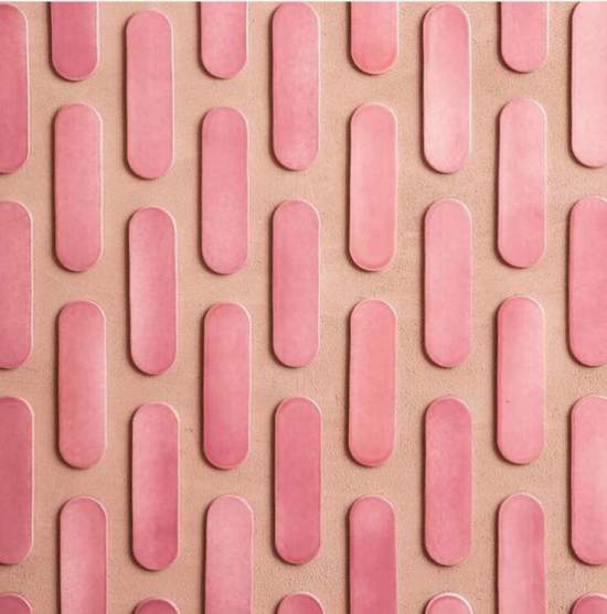
This candy-shaped-ceramic-tiles is from Drop It Modern. Make sure to visit their websites for more such trendy designs.
Check out our works on Instagram and Facebook
Here are a few hand-picked articles for you to read next:

