Tale of our pandemic project
Amidst the chaos and uncertainty of the COVID pandemic lockdown, the one thing that kept my spirits up was this project. The construction restarted after a long long break and I found myself getting drowned in its execution. We had completed partial work when the lockdown was announced and it was onerous to finish the project with limited labour and material. Some fabrics we had chosen earlier were discontinued and some materials weren’t available leaving us on a quest for alternatives amidst the lockdown rules.
Site visits with double masks and coordinating revised drawings from our work from home team made this project happen and thus I feel like it will always stay close to me. Here is a brief look into the interiors.
As you enter into this chic Navi Mumbai residence one can’t help but notice a myriad of luxe design traits that are spread all over. Located in Mohan’s palms, this 2 and a half BHK apartment is surrounded by an abundance of greens, having Karve Lake and Tricity promenade in proximity makes the setting a complete steal for any designer to work on.
The Vibrant Luxe Abode with views of the plush Tricity promenade projected on the windows. The clients with a clear picture of their requirements in their head asked me to create a clutter-free space with ample natural light. They wanted to come back to a home that exudes cosiness & warmth while accommodating kid’s antics and acrobatics. Simply put they were looking for something that is perfect to host family & friends. They were quite particular about the proportion of luxury that the home must display. It cannot be so less that the place looks pale and isn’t so much that the room looks daunting.
With these guidelines in place, I was entrusted with the design of this house. The outcome was a home that combines different functional spaces using patterns, colours and textures. I was so happy to see my idea, to create a bespoke luxe design that adds meaning to the client’s everyday life was exuberantly evident in every detail of each room.
With a definite understanding of the client’s need for a clean, elegant and sophisticated design, I started out by creating some pastel mood boards while adding a tinge of statement-makers around the space. My aim was not only to curate a design that evinces luxury but also maintains its simplicity at the same time.
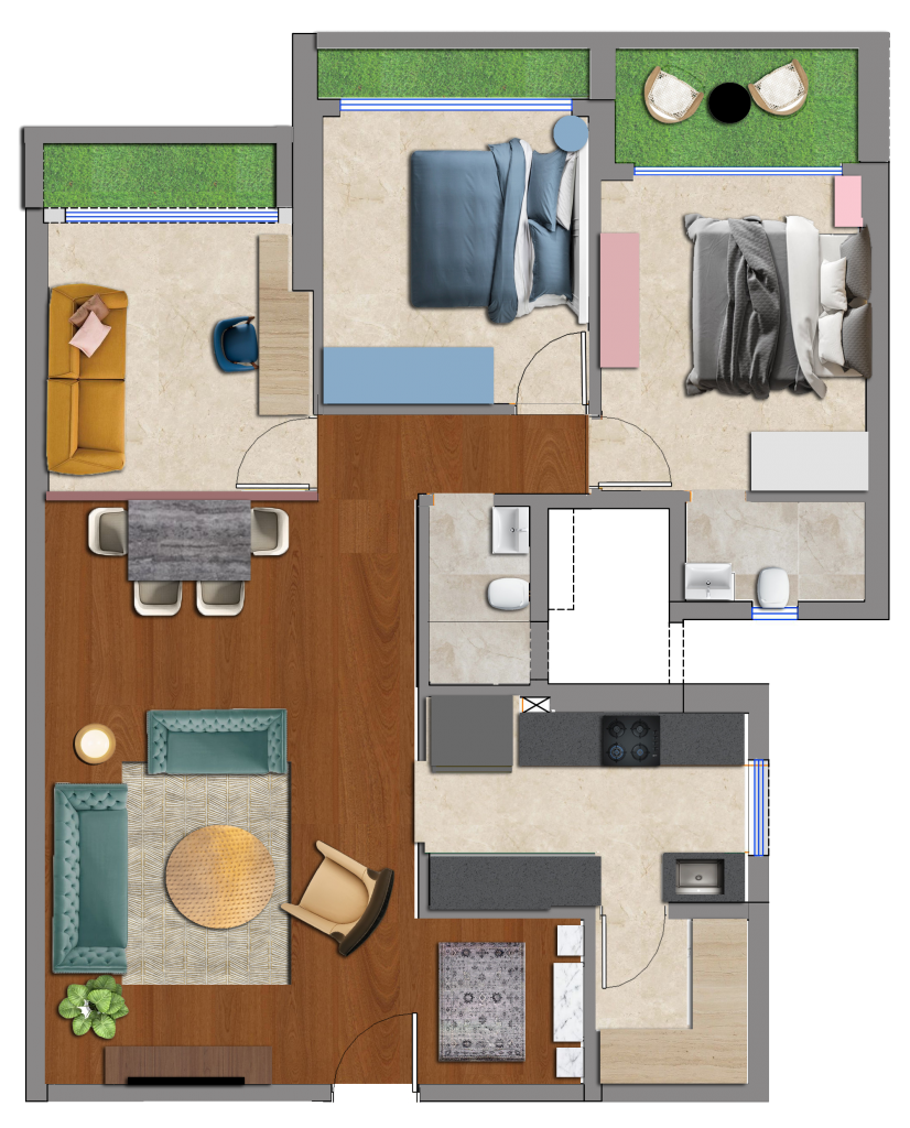
The main door opens into the living room which looks as cosy as luxurious. Due to the absence of a visual barrier space therein opens up into the dining area. The study was added to avoid a long narrow living dining and create a better use for space at the end. While going ahead one cannot miss a peep into the kitchen with its vibrant backsplash and the pill-shaped bar console opposite dining. Upon entering the passage, there is the study room on the left and the other two bedrooms on the right. The bedrooms are on the end of the passage maintaining utmost privacy for the family’s personal space.
Below is a deeper dive into the details of every room.
Living-Dining Area:
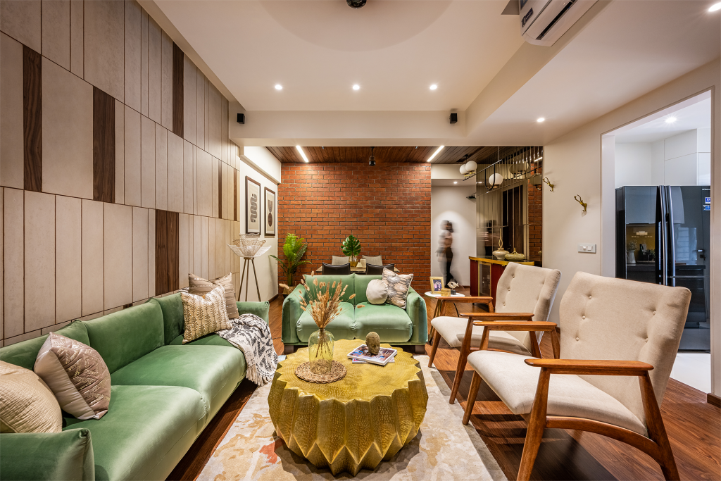
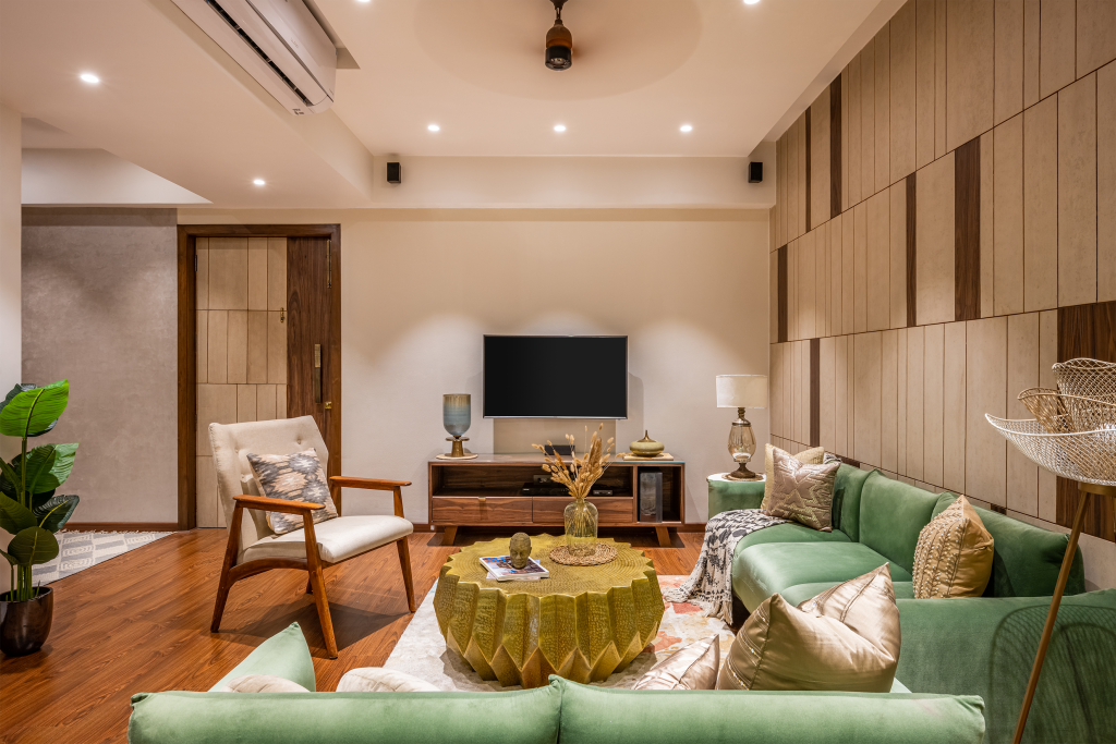
The living area serves as a perfect vantage point while standing amidst bursts of bold colours & textures giving the apartment a chic modern look. The muted colour scheme paired with a red brick wall and textured marble dining tabletop create the perfect composition of visual variety. Wooden flooring in the living and passage areas brings in a tinge of warmth to this cosy space.
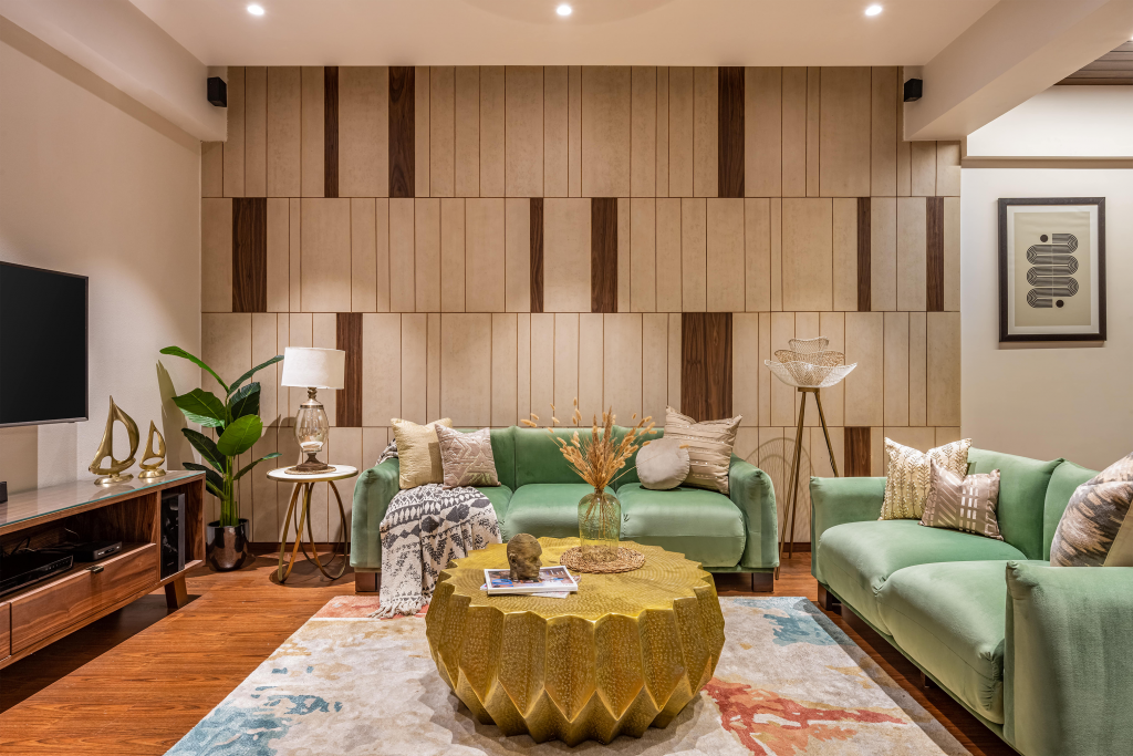
A sage green sofa with loveseat printed cushions and a wine colour bar console adds cherry pops of colour to the neutral shell that encompasses them. Shiny metallic luxe finishes are induced in the form of brass through the centre table, bar console and other furniture fittings.
The mirror glass wall lends a shiny metallic edge adding to the luxe factor of the space. Colourful potted home plants not only bring nature to the living room but also create a symphony of greens with the green sofa and love seat.
The brick wall serves as a backdrop for the rustic dining table whose chair’s upholstery in grey blend very well with the monochrome finish of the space. The chairs and table have a light-airy look which gives a clean finish to the setup. A pill-shaped bar console breaks the grid of straight-line furniture
Kitchen:
The kitchen design provides for a separate sink counter to segregate the wet and dry areas. It adjuncts the lineage of the neutral coloured living room with mainly grey and white on its palette. Adding to its vibrancy; the bright yellow backsplash makes this functional space come alive.
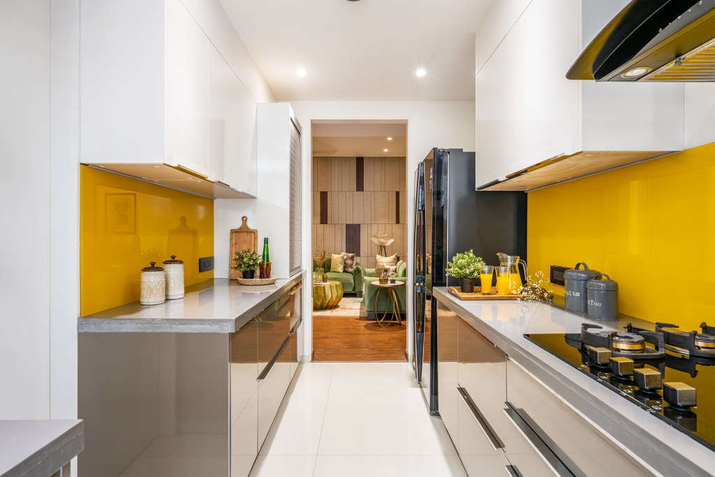
The kitchen is designed keeping in consideration the clients need for a clutter-free space all the while creating ample of storage which is the key requirement of any Indian home. The utility is optimized by providing a tall unit and more than enough room for accommodating a double door fridge without compromising on other spaces. The kitchen also has a secret storage room that can be accessed through a well-camouflaged door.
You can read more about parallel kitchen design here.
Master Bedroom:
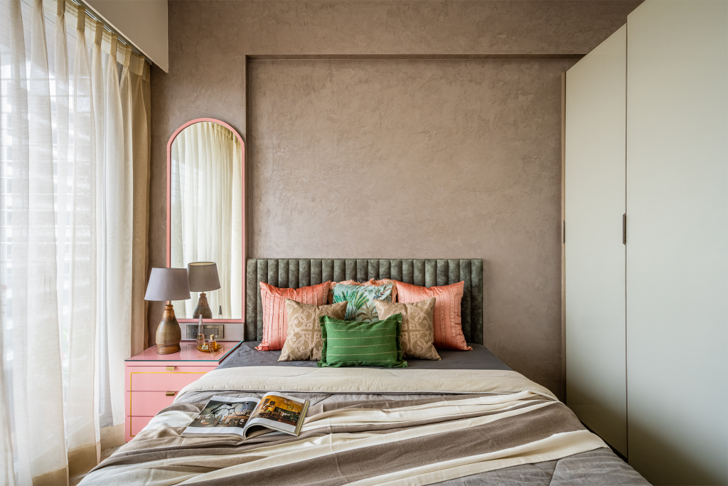
The master bedroom is outfitted in dove grey creating perfect juxtapositions to the walls finished in textured paint. This ensemble blends well with the other two colours in the room, namely; sage green headboard and pastel pink console table. Pink which is generally perceived as a feminine colour rather revives the dark neutral shades without making the room gender-specific.
Kids Bedroom:
The client has two kids, a boy and a girl. Therefore, the room is designed to consider all gender-neutral concepts while being considerate of space for future growth. The kids’ likes and preferences would change with age and it is therefore designed keeping that in mind.
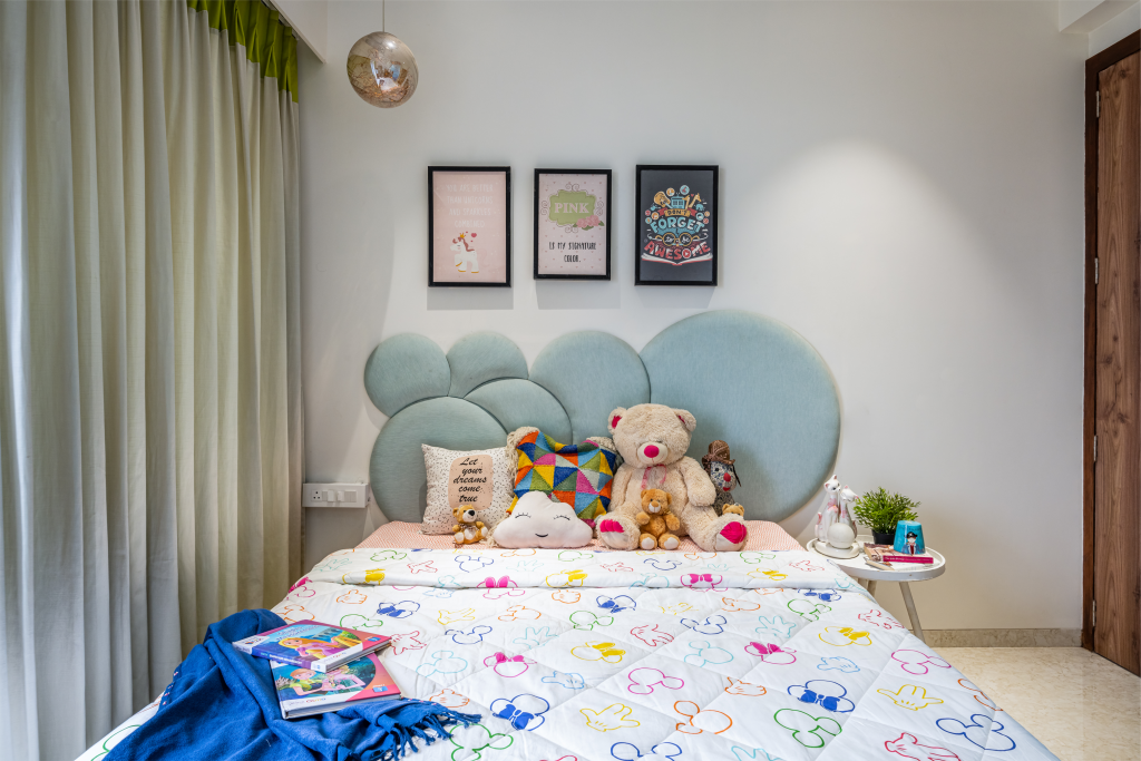
All furniture is finished in white and blue, giving the room an airy, light-kissed look. Continuing the blue saga, the wardrobe is designed in shades of blue while the headboard is finished in blue suede fabric.
Study room:
An exposed brick wall was added in the elongated living room to create a study at the other end, opposite of the main entrance. I didn’t want a long narrow living area and even the clients were looking for a way to add a study, hence this was the only civil intervention we executed in this house. A mustard daybed paired with a turquoise green and oak finished study table are highlights of this adorable study room.
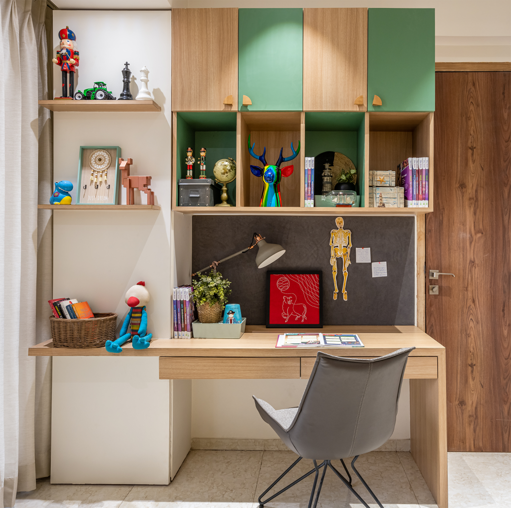
With the appropriate amount of overhead storage and display area, it exhibits vibes of excellence and discipline. A soft board is also provisioned considering the point of keeping things clutter-free.
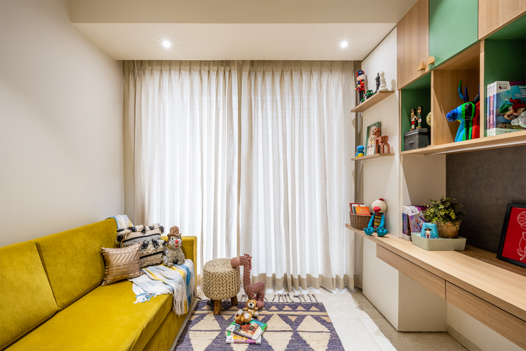
Apart from how gorgeous it turned out to be, the rooms were small and it was indeed a challenge for us to add elements without making the space look confined and congested. Hence, the materials, furniture, patterns and colours used had to be carefully selected so as to make the house look sophisticated.
This project taught me that despite any and every hindrance there is always a way. With the client’s request to not push the handover any further and no signs of the pandemic getting allayed, I found myself tackling multiple issues in regards to labour, installation, material, constraints, etc. But taking a turn around the house on the last day, made me feel like all the hard work was paid off.
I’d love to hear what you think about this project. Please tell us in the comments below and we’d be happy to respond.

